Why the numbers show through your paint
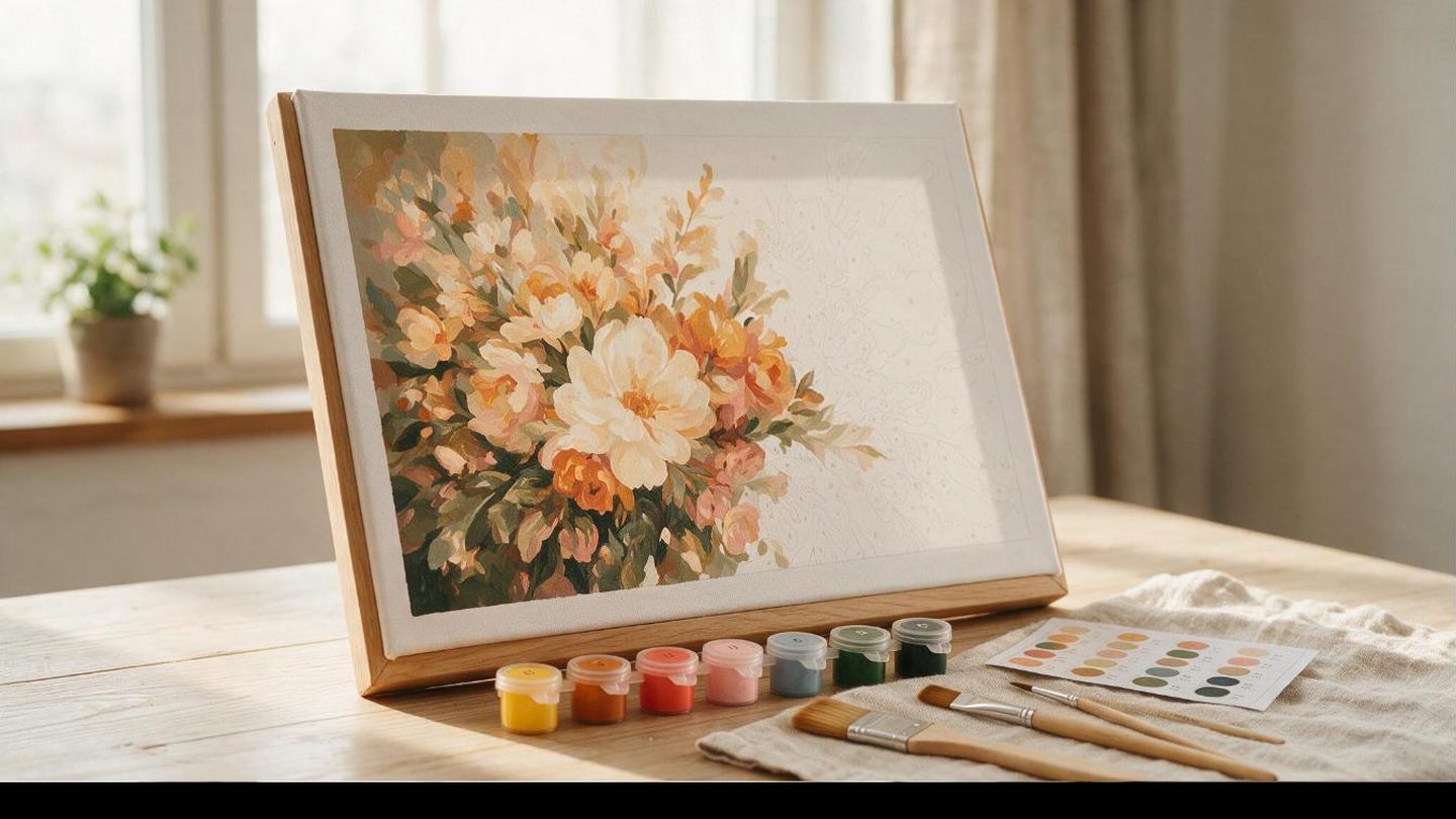
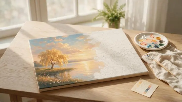
You are three evenings into a canvas, you step back to check your progress, and there it is. A faint grey number, ghosting through what was supposed to be a clean sky blue. It is one of the most common frustrations in paint by numbers, on any kit at any price, and it has nothing to do with your skill.
The short answer
Numbers show through because light colours (whites, pale yellows, pastels, light blues) are naturally more transparent than dark ones. It is chemistry, not a flaw in your painting. Fix it with two thin coats instead of one thick one, letting the first dry completely before the second. Never try to fix it with wet paint on wet paint, that lifts the printed ink and makes it worse.
Why it happens in the first place
Paint pigment gets its colour from particles suspended in a binder. Dark pigments (blacks, deep reds, navy) pack a lot of colour into a thin layer, so one coat covers almost anything underneath it. Light pigments are the opposite. Whites, pale yellows and pastels use less concentrated pigment by nature, which means light passes through the paint film more easily and the number printed underneath keeps showing.
This is true of every paint by numbers kit on the market, digital or physical, cheap or expensive. It is a property of the paint, not a sign that you bought a bad kit or that your printer laid down the numbers too dark.
The colours that do it every time
If you know which colours are the usual suspects, you can plan for them instead of being surprised by them halfway through a canvas:
- White and off white, the single worst offender on almost every kit.
- Pale yellow and gold, especially over a printed black number.
- Light pink and other pastels, for the same reason as white.
- Sky blue and light turquoise, common in large background regions.
- Beige and cream tones, which sit close to the paper colour to begin with.
Notice the pattern: it is almost always the light, large background regions, not the small detailed ones. Painters run into this most on skies, water and skin tones, which happen to be exactly the areas where a patchy result is most visible.
The two coat fix
How to get clean coverage every time
- Paint the first coat at normal thickness. Do not skip it or thin it down trying to save paint, a thin first coat just means you need three coats instead of two.
- Let it dry completely. Acrylic dries fast, usually 15 to 20 minutes, but touch it first. Painting a second coat over a tacky first coat drags pigment and ink around instead of sealing it in.
- Apply a second thin coat. By the second pass the number is already mostly buried, so you need far less paint than the first coat took.
- Check it dry, not wet. Wet paint always looks more opaque than it dries. Judge coverage after it has fully cured, not while the brush is still on the canvas.
What not to do
The instinct when you spot a number is to load the brush and scrub at it. That is the one thing that makes it worse. Working wet paint back into a partially dry layer lifts the printed ink underneath and smears it into the fresh colour, which is how a faint number turns into a grey smudge that no amount of extra paint fixes cleanly. If a region needs a third coat, let the second one dry first, the same as the first.
Watered down paint is the other common cause. Diluting acrylic to make it easier to spread also dilutes its covering power, so a heavily thinned white will show the number through every coat you add. If you want smoother application, use a bigger brush or a touch of paint medium made for the purpose, not water.
Does this happen on digital kits too?
If you print a digital kit at home and paint it with real acrylic, watercolour or gouache, yes, exactly the same physics apply, your paper is the canvas and the same light colours will behave the same way. If you paint the digital file directly on an iPad in an app like Procreate, no, this specific problem disappears, because the numbers sit on their own layer and get hidden the instant you paint over them, regardless of how transparent the colour is. That is one of the quieter advantages of painting digitally rather than on paper or canvas.
One more thing that changes the picture
The higher the colour count on a kit, the smaller and more numerous the individual regions become, which mostly works in your favour here. Instead of one enormous sky region asking a pale blue to cover cleanly in one pass, a 96 or 120 colour version breaks that same sky into several smaller regions with subtler tonal shifts, so each individual patch of light colour is smaller and easier to fully cover. Our newest line, PBN Projects, goes up to a 120 colour bonus level across six difficulty tiers on the same design, so you can start on the easier 16 or 24 colour version while your coverage technique is developing, then move up once it is second nature.
See the 120 colour PBN Projects kits
Forty one designs, six difficulty levels per kit from 16 up to a 120 colour bonus tier. The highest colour count we have found anywhere in the paint by numbers market.
Browse PBN Projects →Is a see through number a sign of a bad kit?
No. It happens on kits at every price point, because it is caused by the physical properties of light coloured paint, not the quality of the printing or the canvas.
Should I just use a darker version of the colour instead?
Only if the reference image allows it. Swapping a pale colour for a darker one to dodge the coverage problem changes the look of the finished painting, sometimes noticeably. Two thin coats gets you the correct colour without that trade off.
Does a white basecoat under the light colour help?
Sometimes, if you have a spare white paint pot to use as a primer coat before the actual colour. It adds a step, but it can reduce a stubborn area to a single top coat instead of two or three.
Will a bigger brush make coverage worse?
No, the opposite. A bigger brush that holds more paint tends to lay down a more even, consistent layer than a small brush being dragged back and forth to stretch a little paint over a large area.